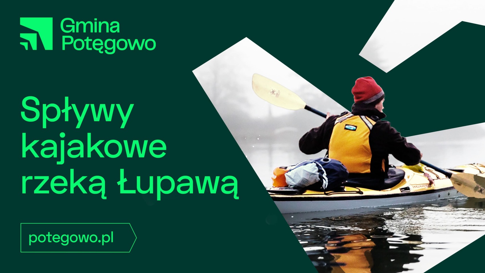
Potęgowo is a municipality in northern Poland that invests in renewable energy and new technologies. The direction of the municipality’s development is to be emphasised by a new visual identity created by Rio Creativo designers.
The new visual identity is strong in expression. The designers wanted it to express the strength, potential and innovation of Potęgowo. The energy that is characteristic not only of the authorities, but also of the inhabitants and investors is to infect others.
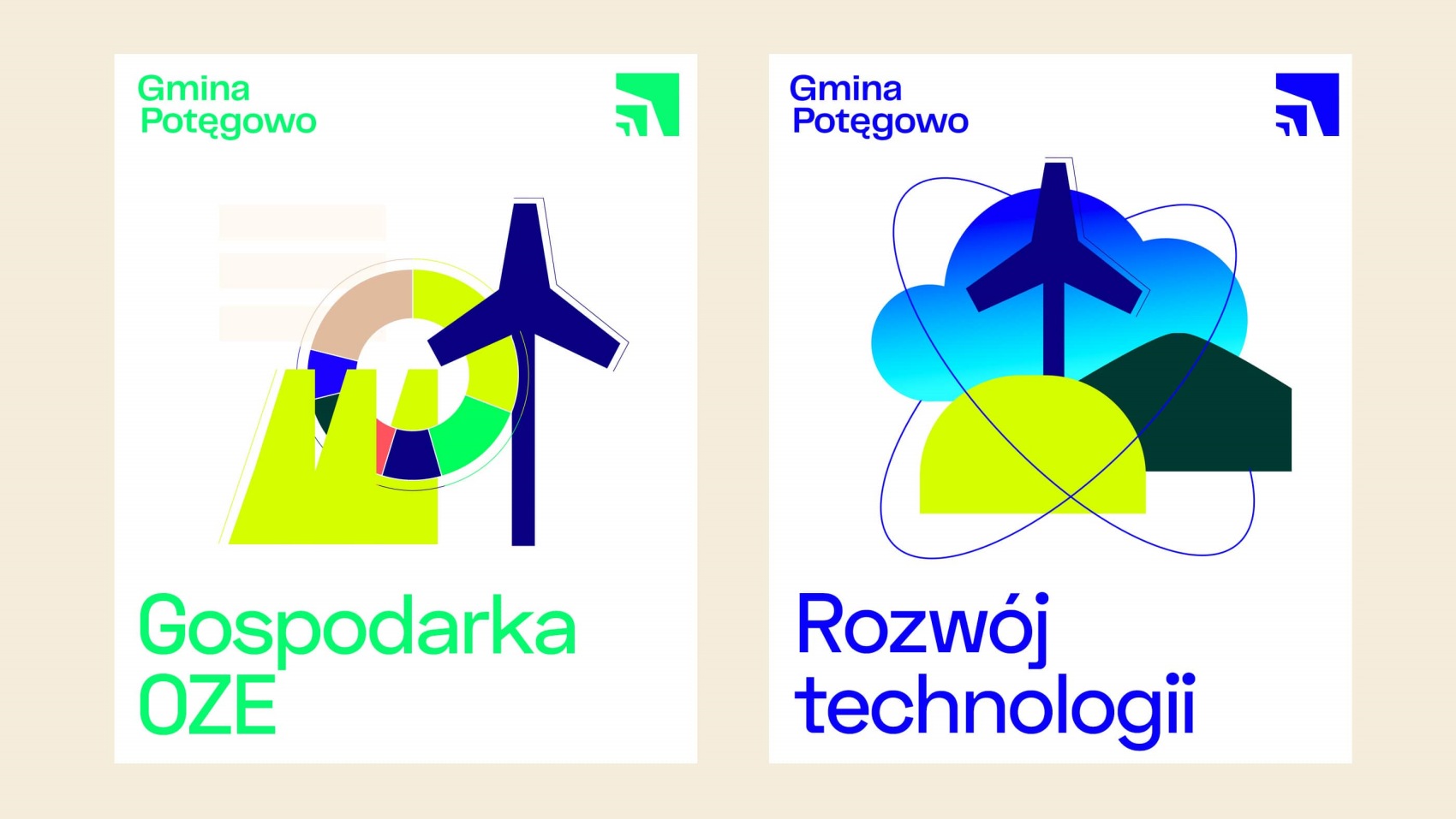
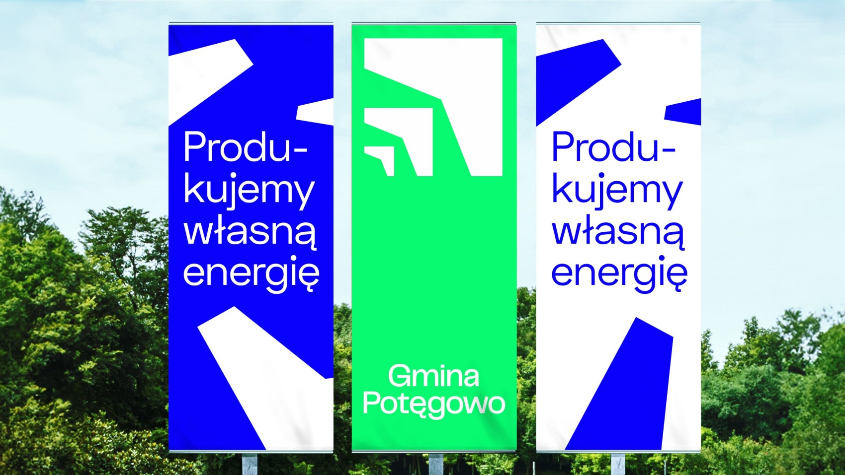
The Potęgowo commune is famous for having the largest amount of electricity generated from RES in Poland and a biogas plant that gives residents the cheapest heat in the country. This has been achieved by investing in environmentally friendly solutions.
The first step in the process of creating the new brand was a deep understanding of the Municipality’s differentiators and values. In-depth interviews, as well as strategic workshops attended not only by the authorities, but also by representatives of business, municipal institutions and villages reassured us that this is a place with a great awareness of the potential it wants to communicate. After all, Potęgowo, is the Power of Possibilities – explains the Rio Creativo team.
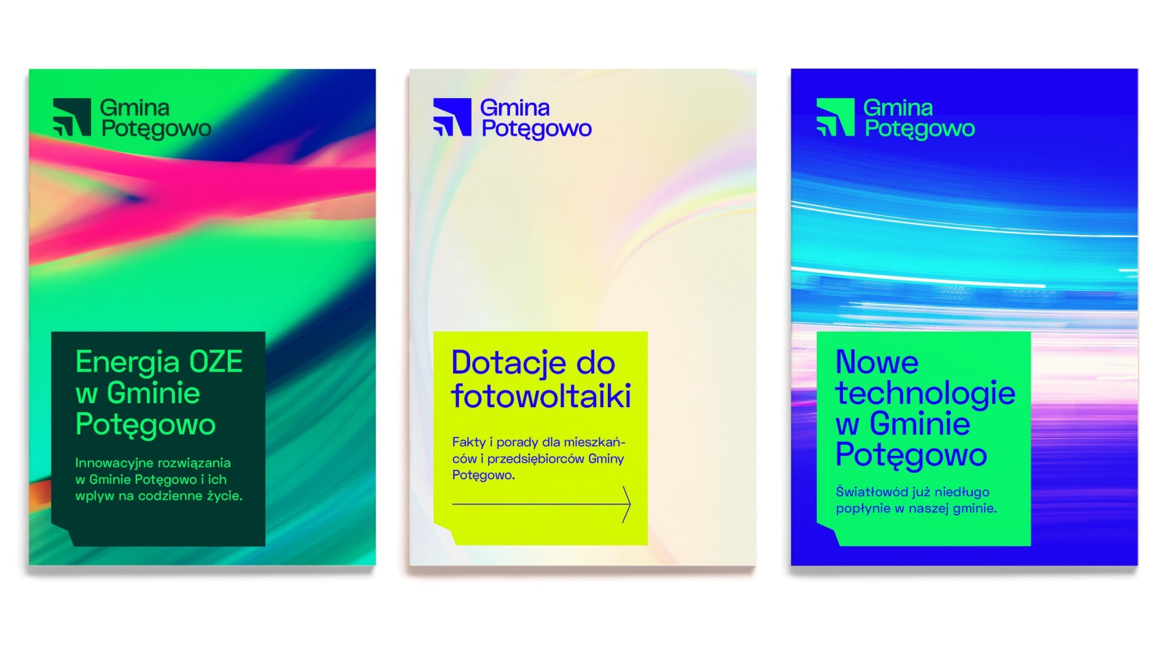
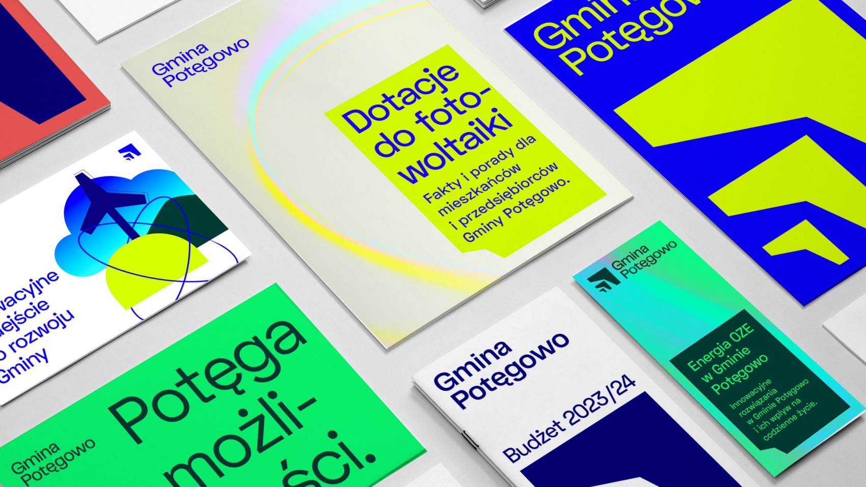
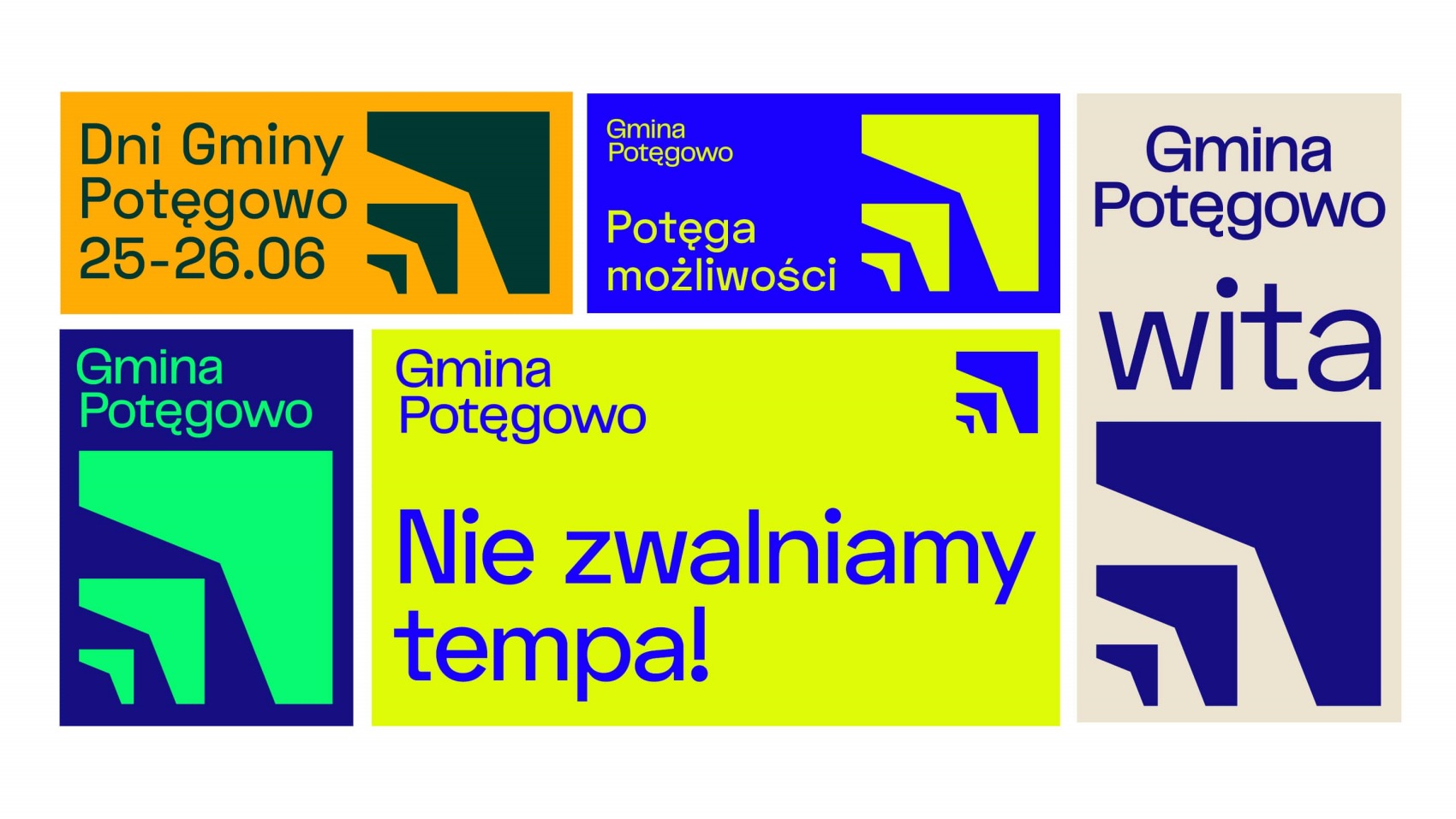
Slogans were developed on which all communication was based. The designers based the communication on Potęgowo’s DNA, which included: pioneering, innovation, courage, openness, inspiration and a positive attitude. These qualities operate at many levels, including among the residents.
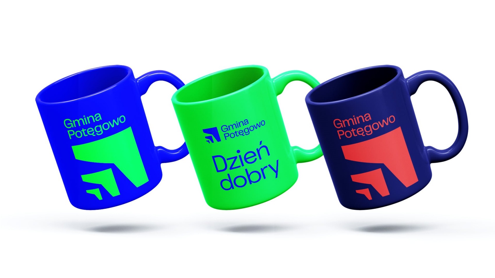
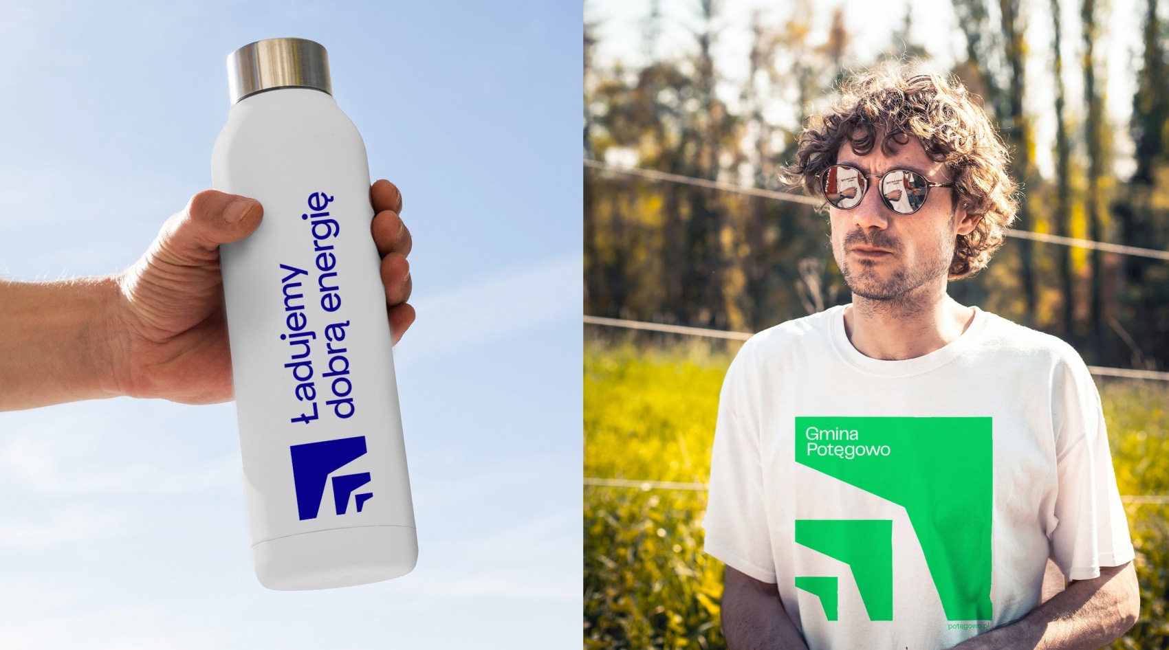
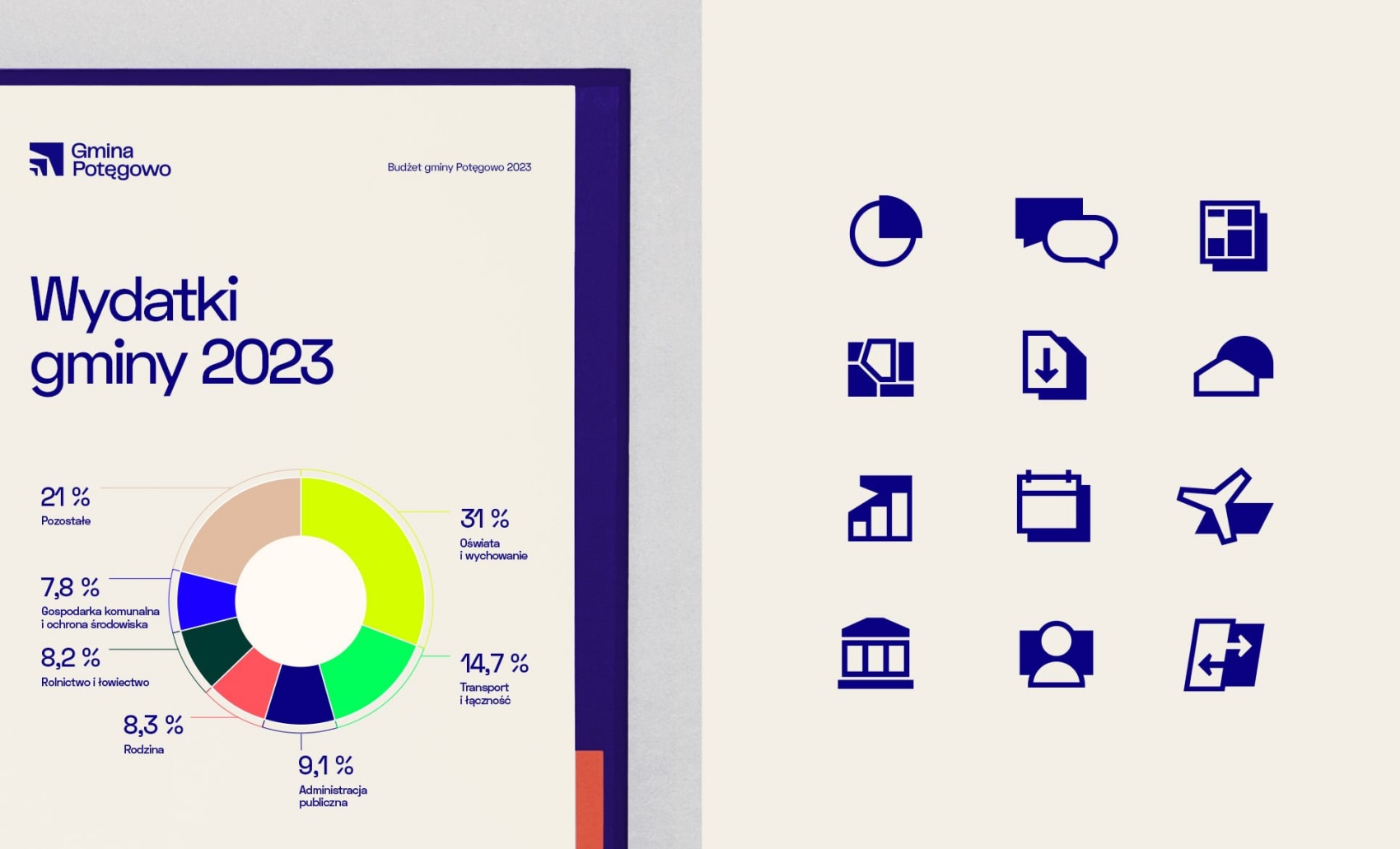
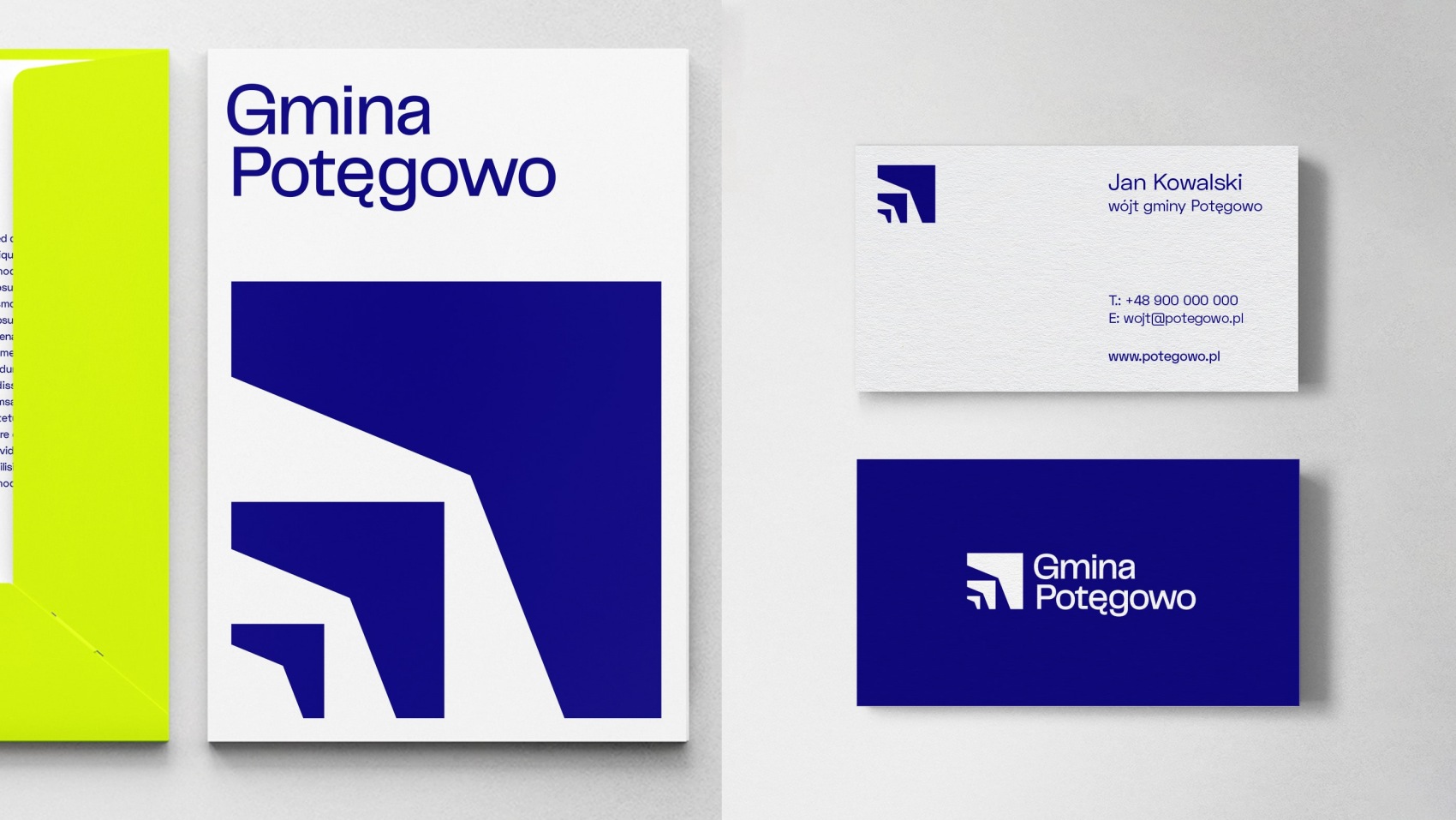
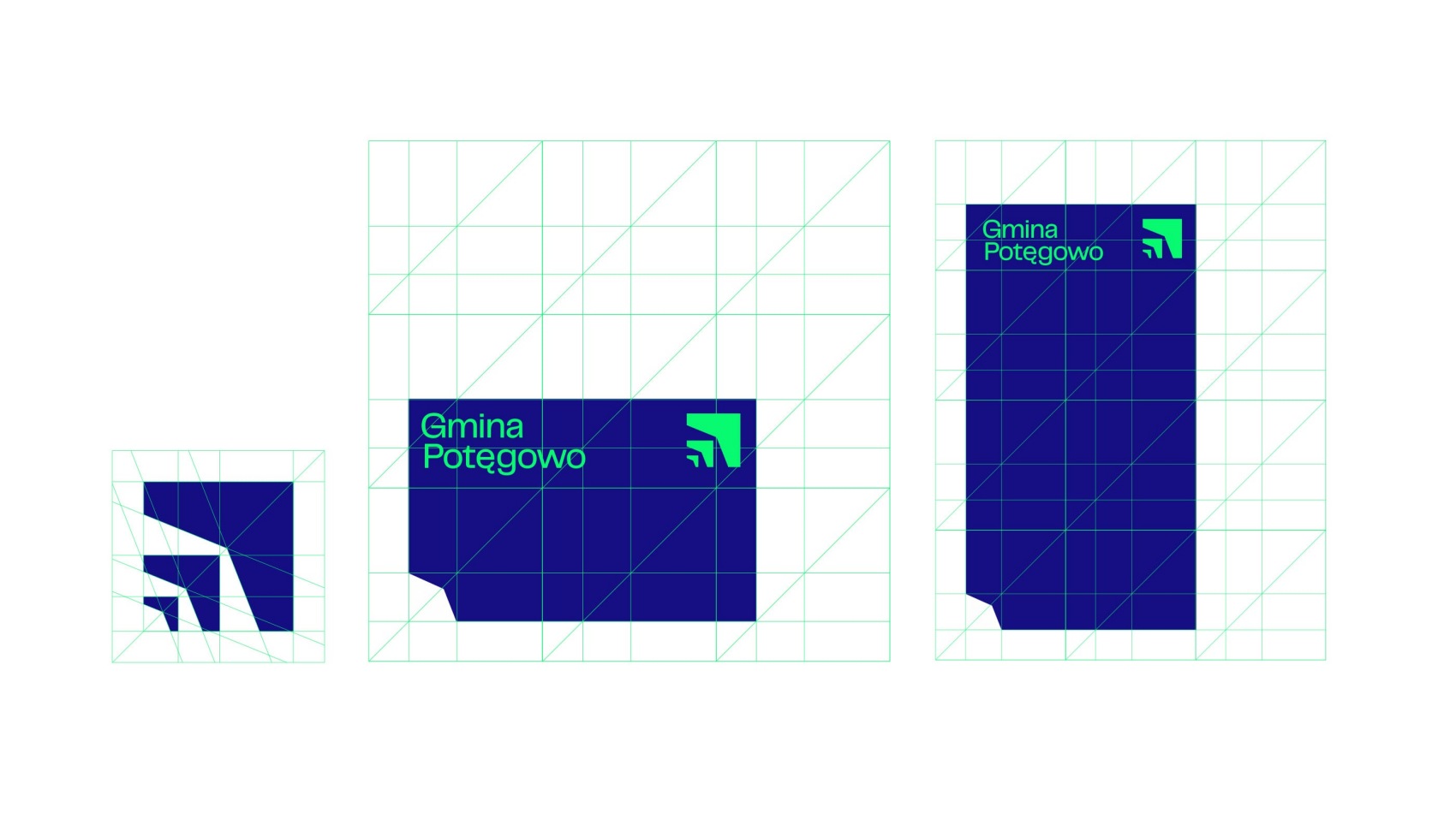
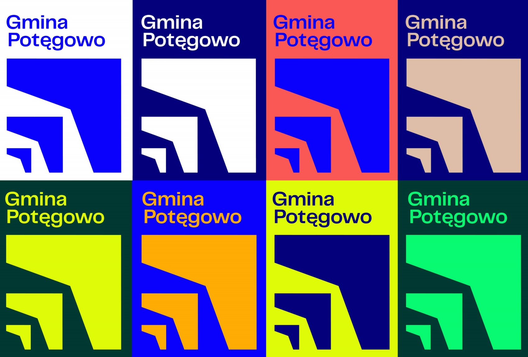
The resulting logo shows not only the strength, but also the development, progress and inspiration of the municipality. The resulting visual identity is bold and stands out in the communication area of other local government units in Poland. The distinctive signet shows not only power, but also development. The designers proposed a bold colour scheme, atypical of colourful internet banners.
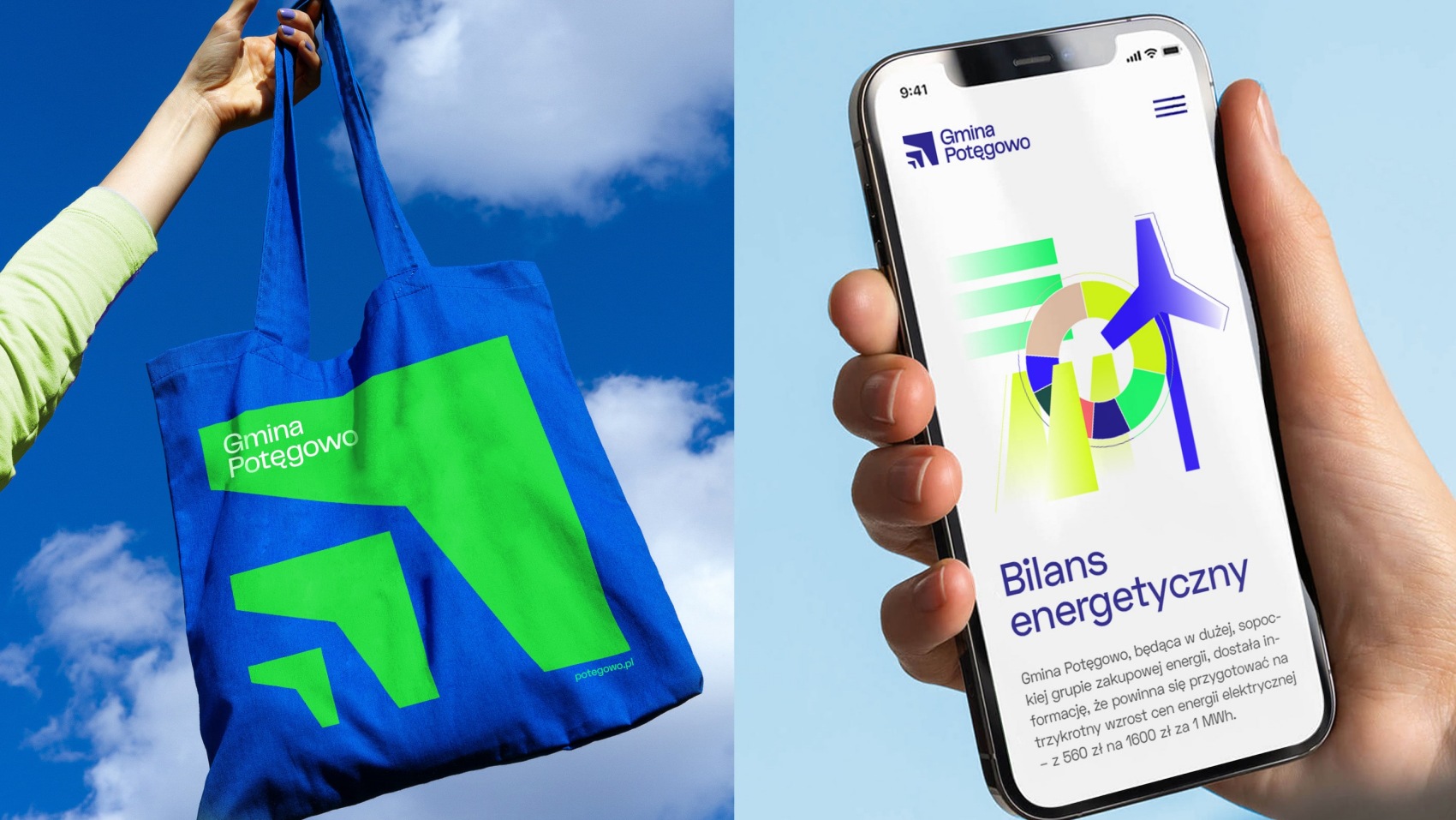
When composing the palette, we took into account the online area, as this is also where much of the municipality’s communication is focused. The multitude of proposed graphic solutions makes the possibility of developing the brand visually almost unlimited,” explain the authors of the concept.
We have previously written about other graphic realisations by the Rio Creativo team. These include the visual identification of the Pomeranian University in Słupsk(READ HERE).
source: Rio Creativo
Read also: visual identity | minimalism | curiosities | detail | graphics | whiteMAD on Instagram