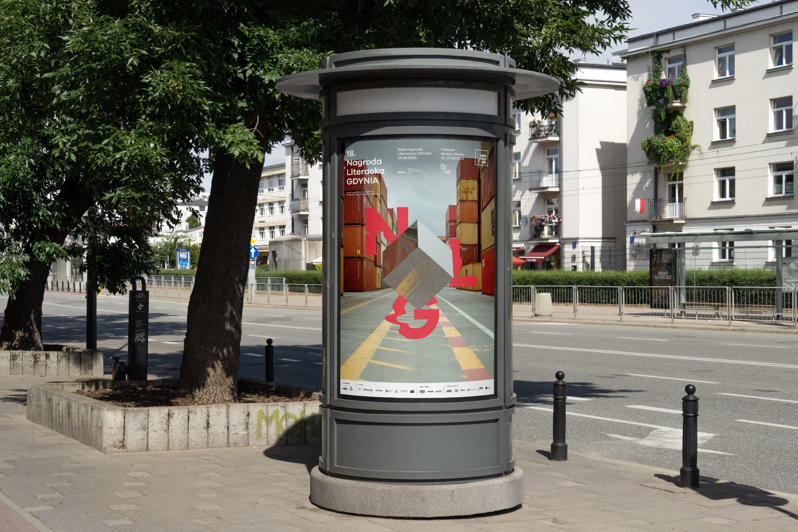
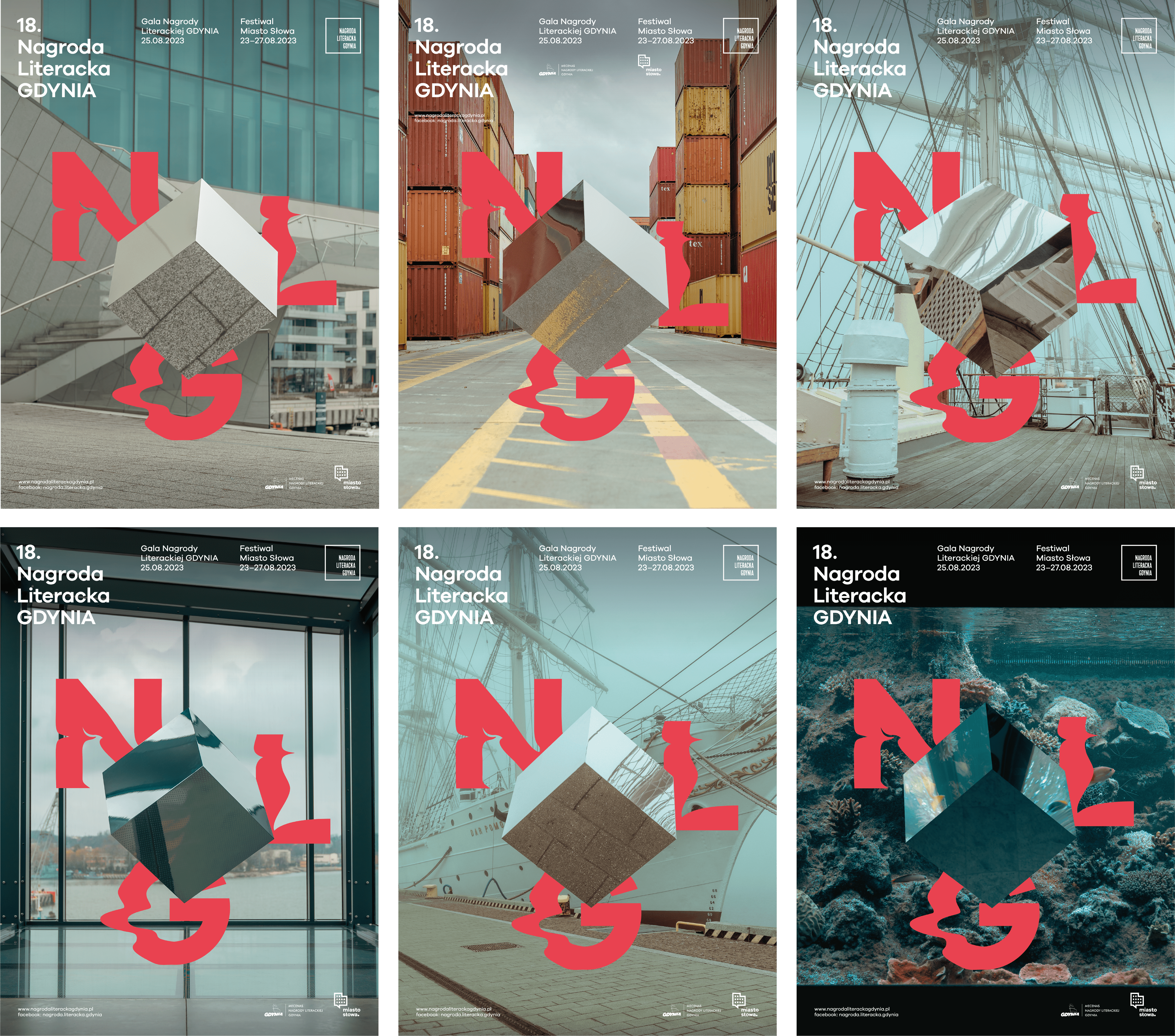
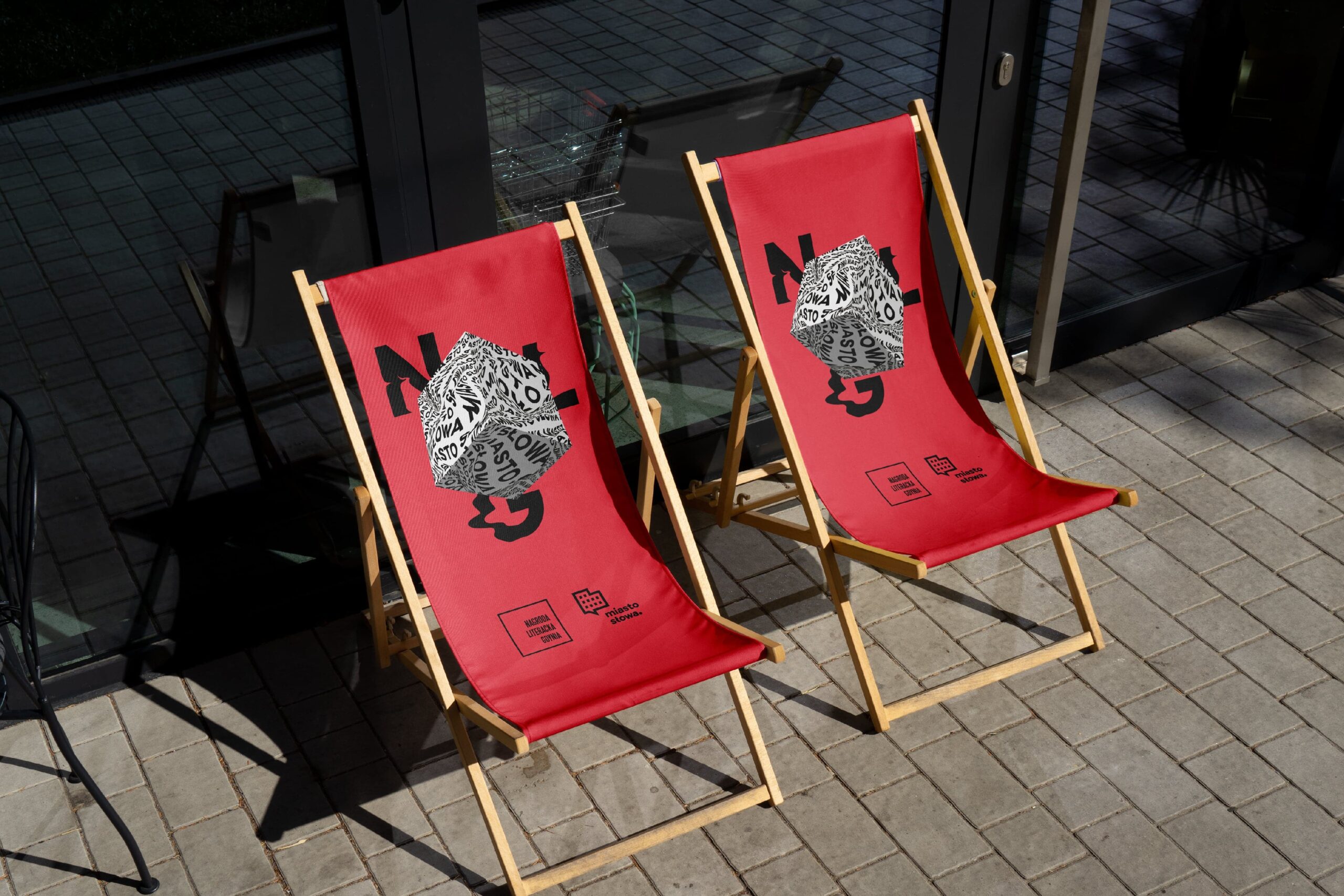
The visual identity of the Gdynia Literary Award was designed by the Polish TOFU Studio. We have written about the studio more than once, more than twice. It is an extremely talented team that wins awards for almost every project. This time, the TOFU artists have outdone themselves. For their visual identification of the Gdynia Literary Award, they were nominated for the European Design Awards in three categories. A big applause for TOFU, a big applause for Gdynia and for all the writers!
TOFU Studio received as many as three nominations to the European Design Awards for the visual identity of last year’s Gdynia Literary Award. We would like to take this opportunity to remind you that this year’s City of Words Festival will run from 28 August to 1 September.
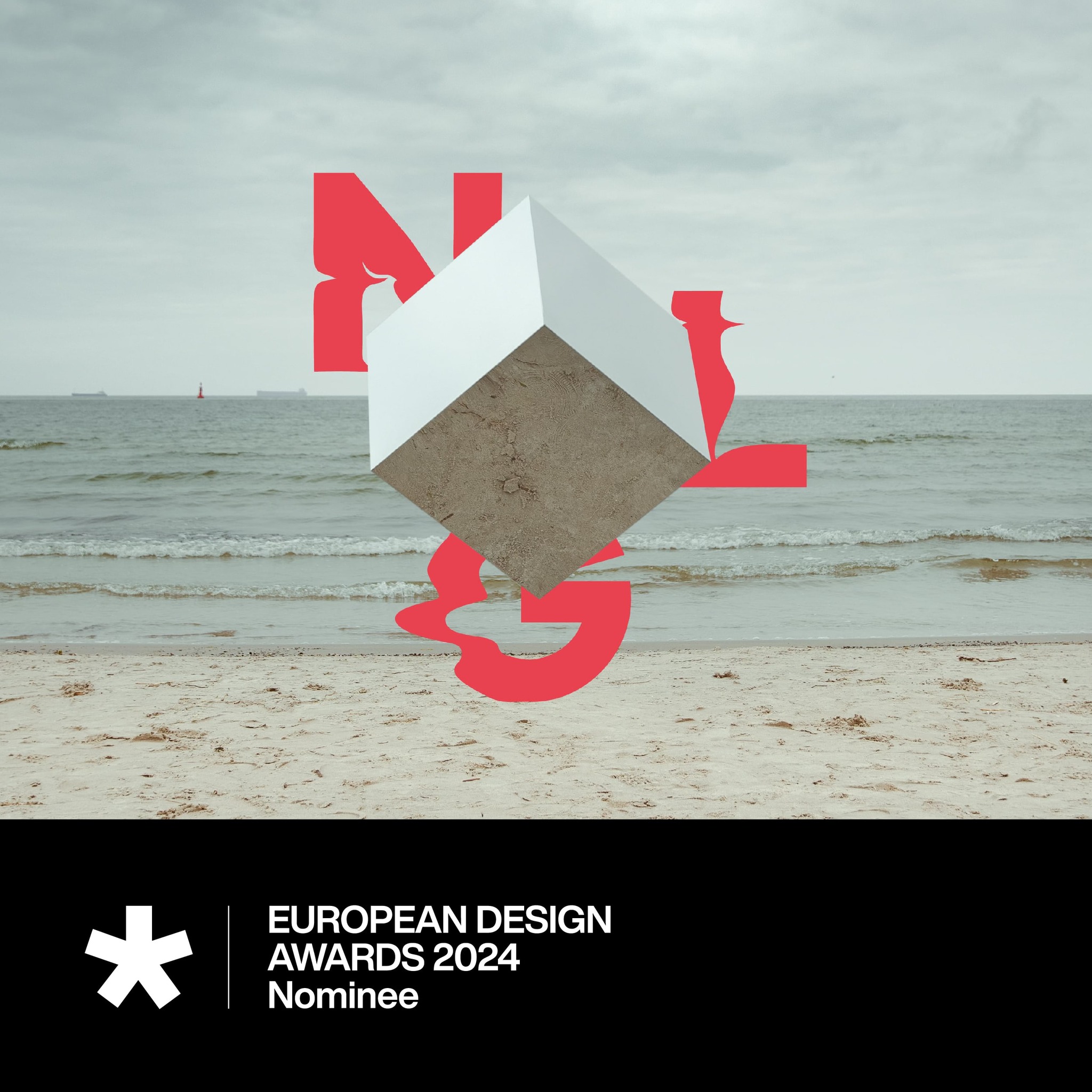
The organisers of the European Design Awards recognised the creativity of the TOFU Studio designers and nominated them for the visual identity of last year’s Gdynia Literary Award. Not only that. The designers will compete for the award in as many as three categories:
- poster,
- integrated identification,
- print identification.
“It is difficult for us to be objective, but the graphic design of our events by TOFU Studio is a source of pride for us every year. Embedded in a certain repetitive typographic motif, yet different each time, surprising us with its creativity and restrained virtuosity,” reads the website of the Gdynia Literary Award.
The premiere of this year’s visual identity of the Gdynia Literary Award will appear soon. We would like to remind you that the City of Words Festival will last from 28 August to 1 September. Once again, it will be an excellent opportunity to meet, among others, the authors of the most interesting books that have recently appeared on the Polish publishing market. The culminating point will be the final of the Gdynia Literary Award. The Literary Awards will be presented on 30 August.

Visual identification of the Gdynia Literary Award – the idea
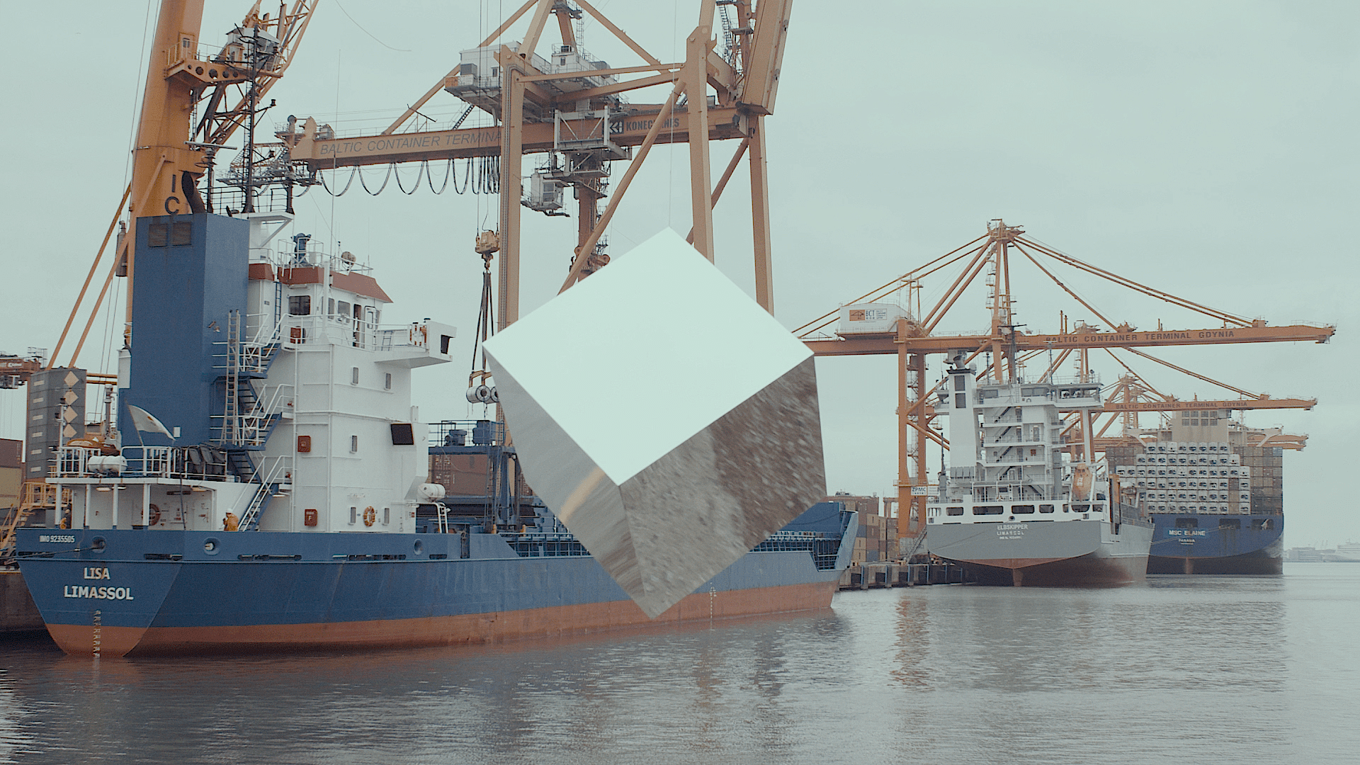
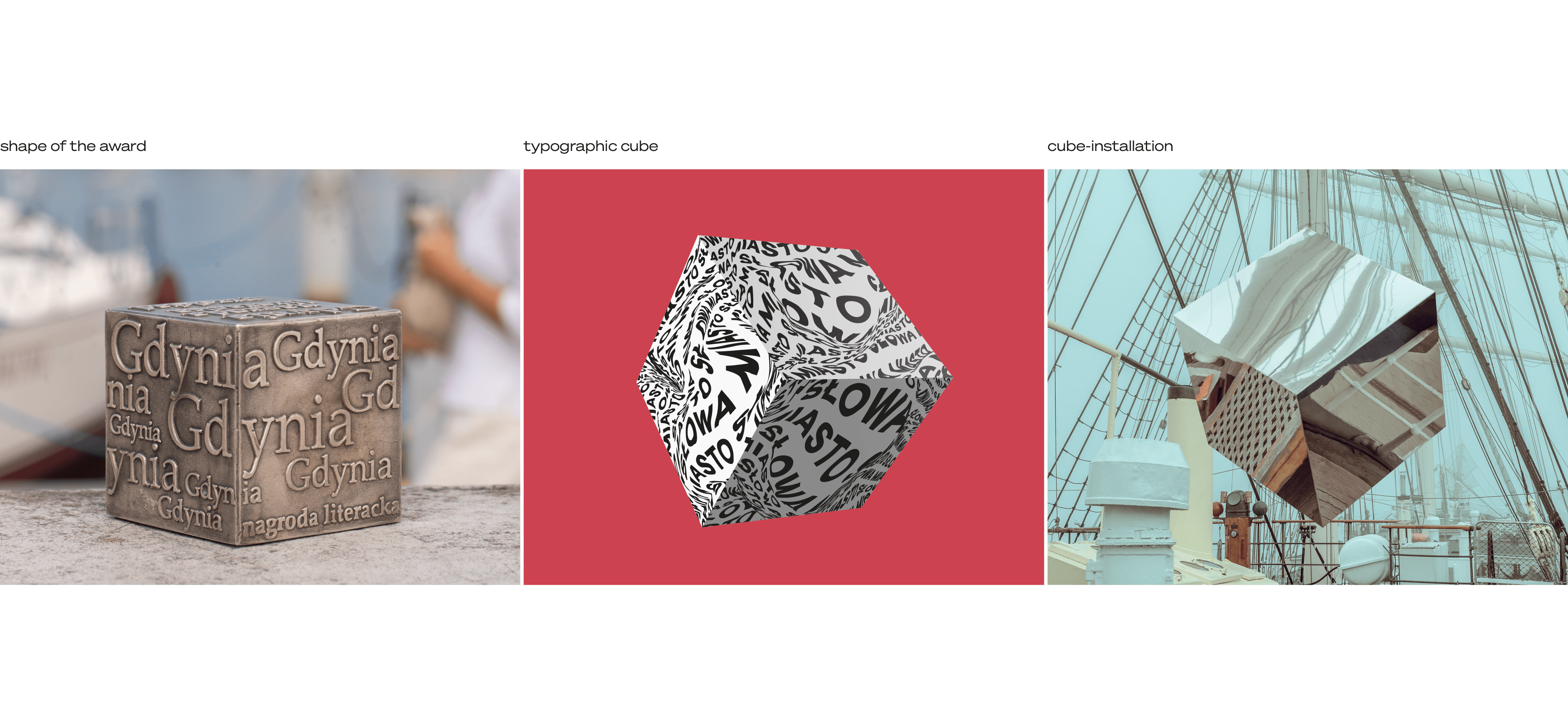
“Our studio was again asked to prepare a complete renewal of the graphic identity of the next edition for 2023, including all visual and promotional materials. This year we decided to focus on the multidimensionality of literature. The cube shape became the symbol of this idea, which also refers to the shape of the award/statuette itself. In addition to the graphic typographic motif of the cube, we also used photography to create and document our installation in various spaces in the City of Gdynia. The concept for the visual identity of this year’s edition was largely based on photography. We created a physical object – a cube of mirrored steel that reflected the surroundings and created a multi-dimensional illusion of space. We then photographed the cube at recognisable, important points in Gdynia: City Beach, the Gdynia Seaport, Sea Towers, the Gdynia Film Centre, the Dar Pomorza ship, the Marina, the Emigration Museum, the Gdynia Aquarium. We wanted to expand our project to include activities taking place in real space, going beyond the realm of 3D modelling.” – reads the TOFU Studio website
More articles on the work of TOFU Studio:
source: TOFU Studio / gdynia.pl / European Design Awards / Literary AwardGdynia
Read also:
